Ocean Cafe
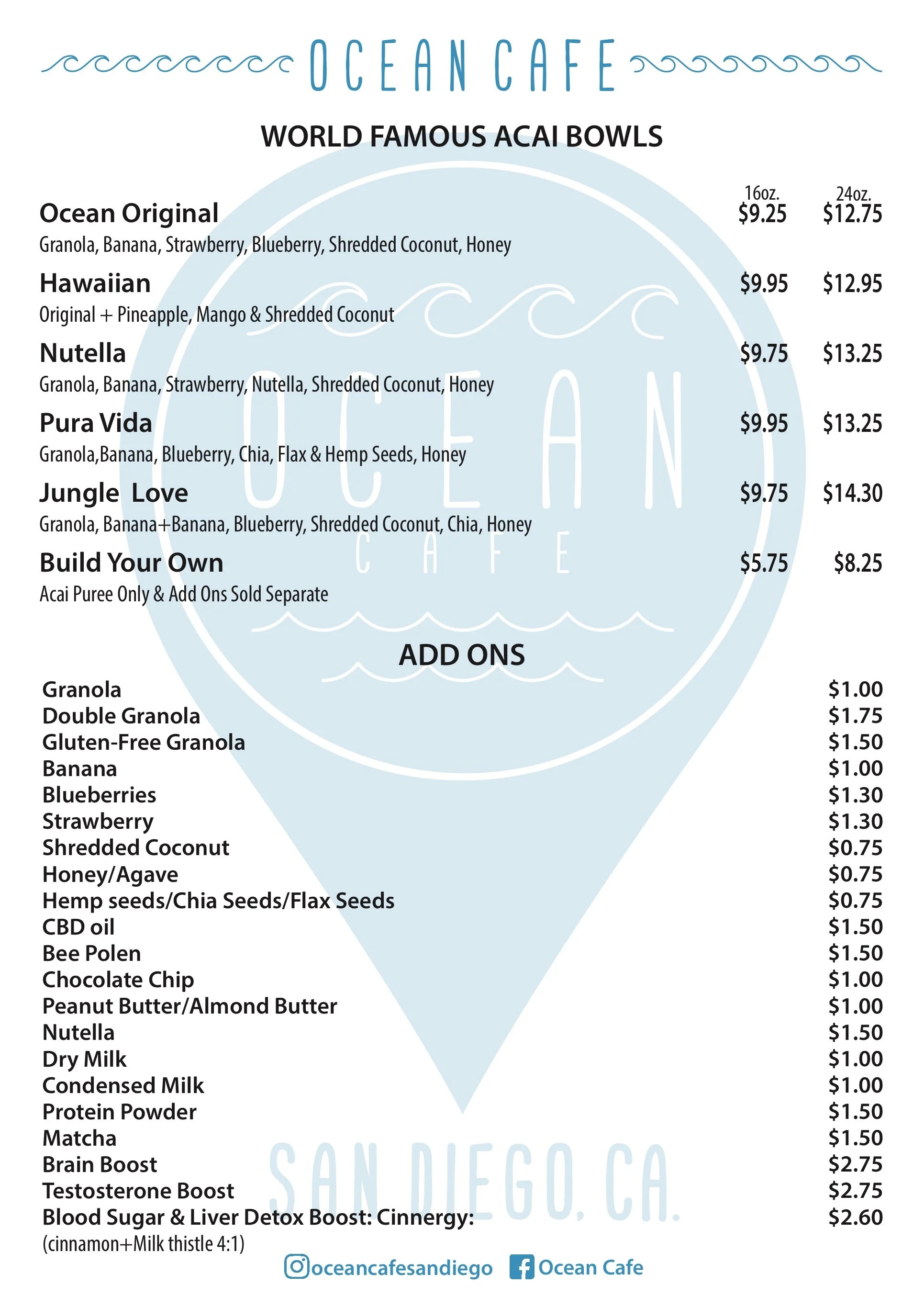
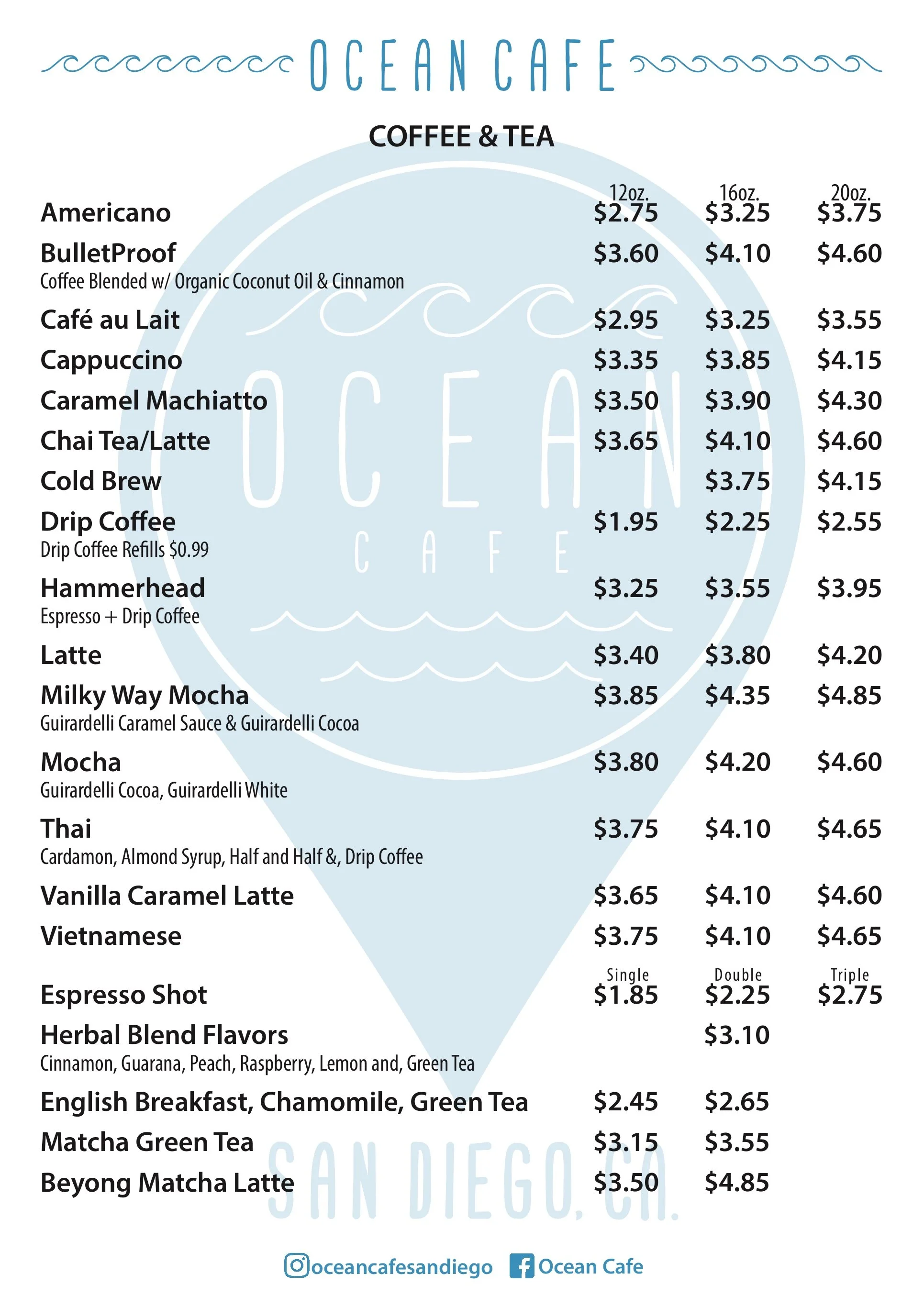
Ocean Cafe is a health conscious cafe located in Ocean Beach California. The client was looking for a logo as well as a menu design. He wanted the logo to look like a “pin” you would see on google maps and the menu had to be formatted for posters he was planning on hanging on the walls of the cafe as wells as a booklet style format to have at each table. The logo needed to match the aesthetic of the cafe and the menu had to be easy to read since he had such an extensive amount of items.

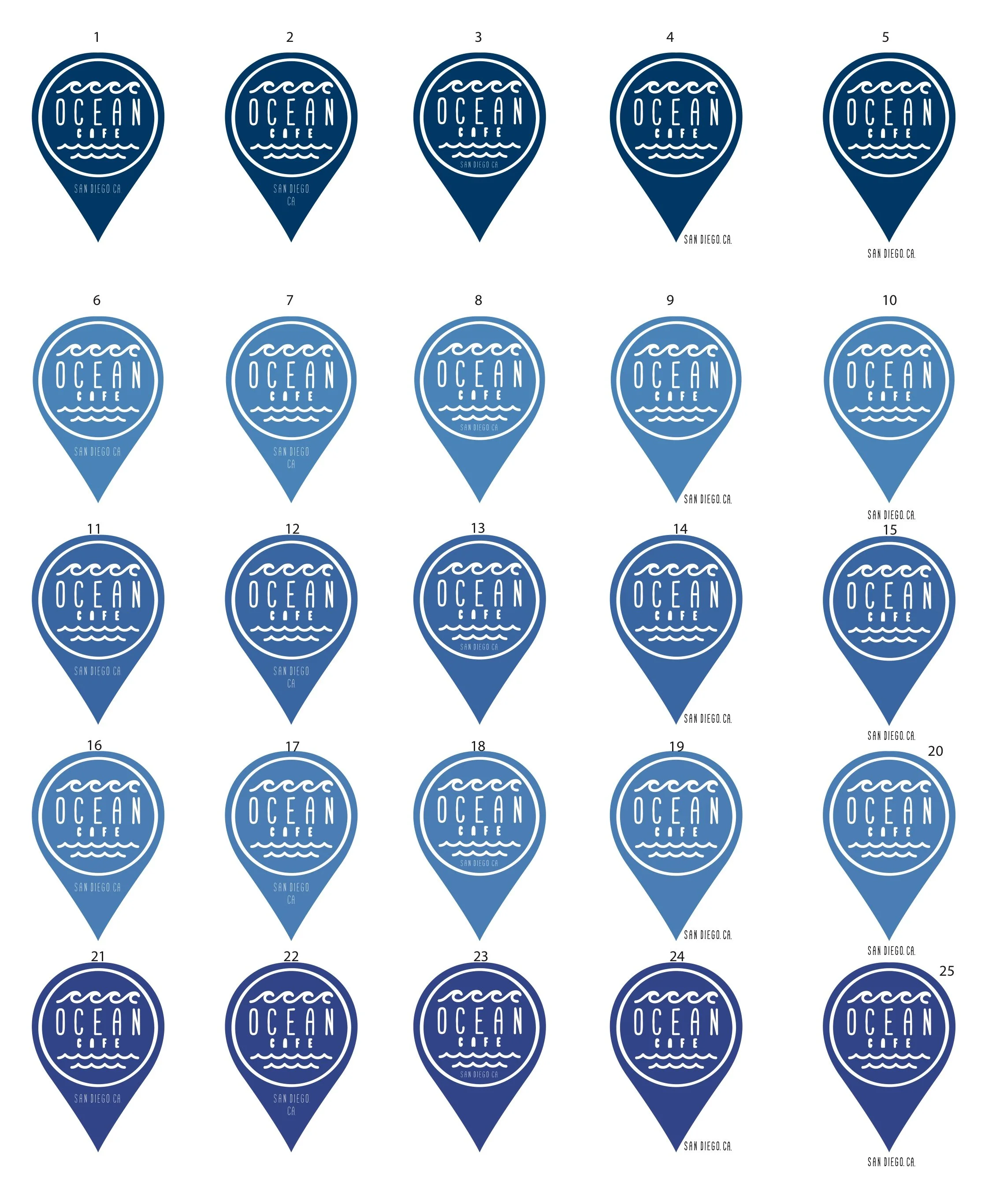
LOGO COLOR STUDY
The client was very happy with the overall design of the logo but was unsure about the main color for the design. I decided to create a color study to allow him to see all the color options at once. Even a slight change in color can have a drastic impact on the impact of a logo as well as the business it represents. The color study allowed the client to compare the colors side by side allowing him to make a more informed decision.
The clients cafe had a very clean, airy aesthetic and the menu items were very health conscious and environmentally friendly. Since the clients cafe was located near the beach I advised him to go with a lighter, almost teal blue to keep in line with the relaxed feel of the cafe and it’s surrounding elements.
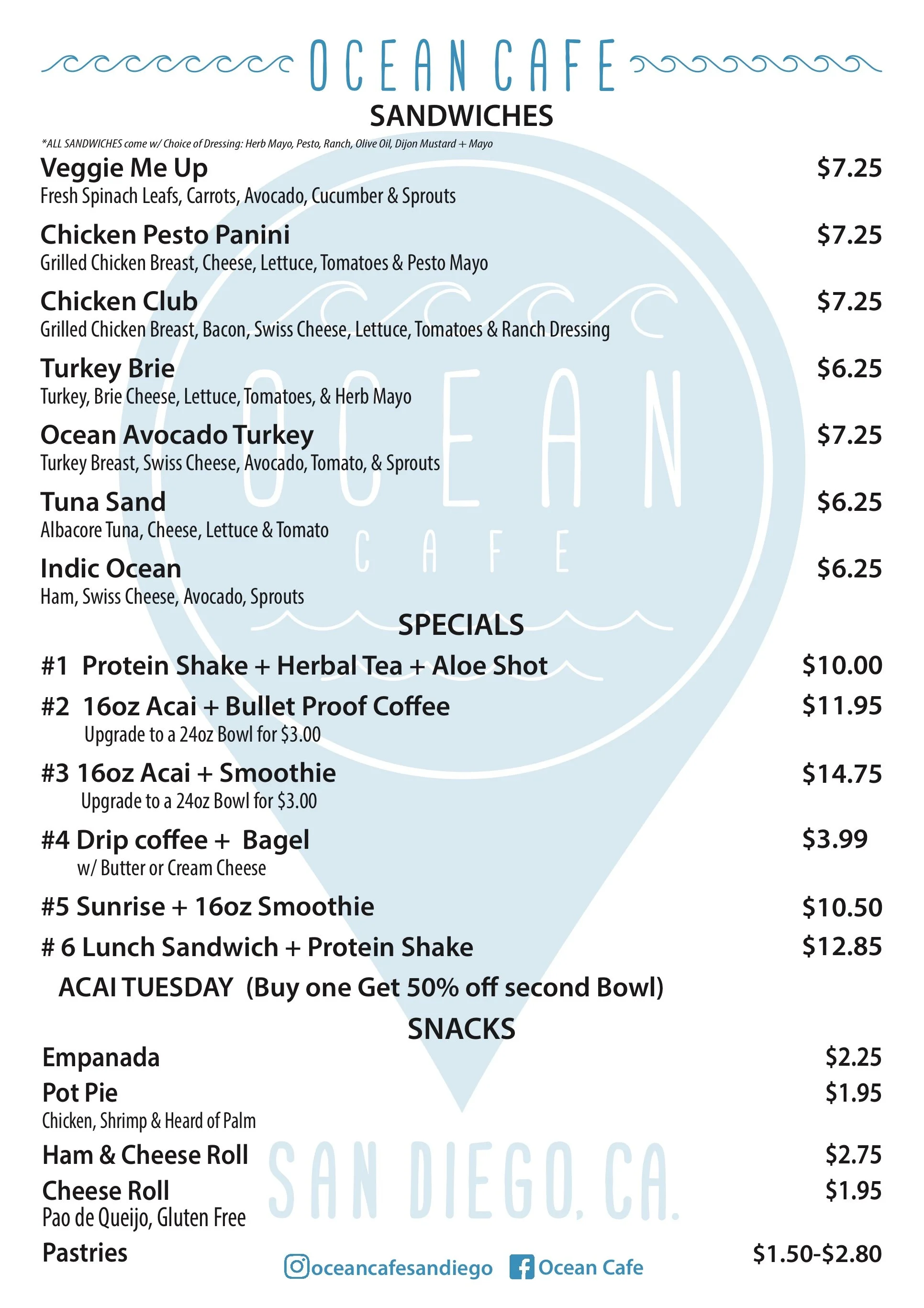
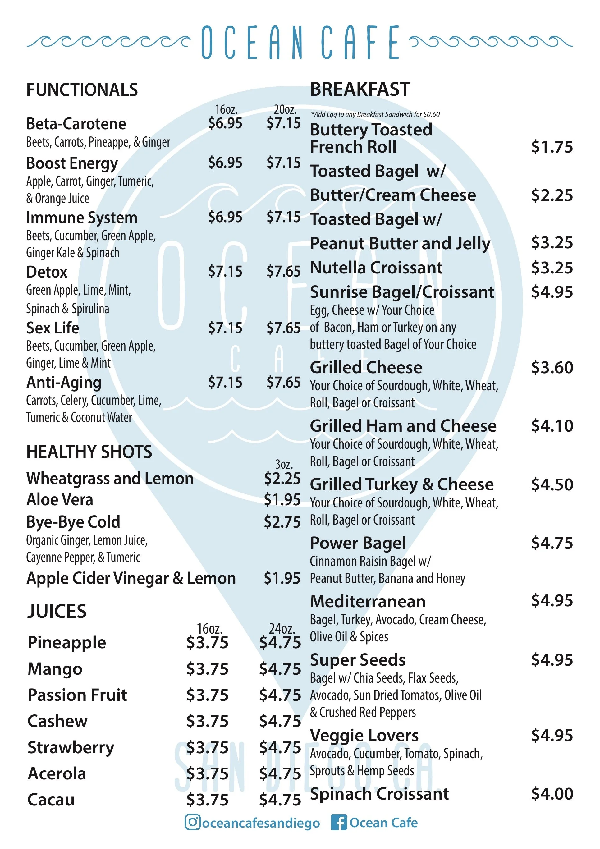
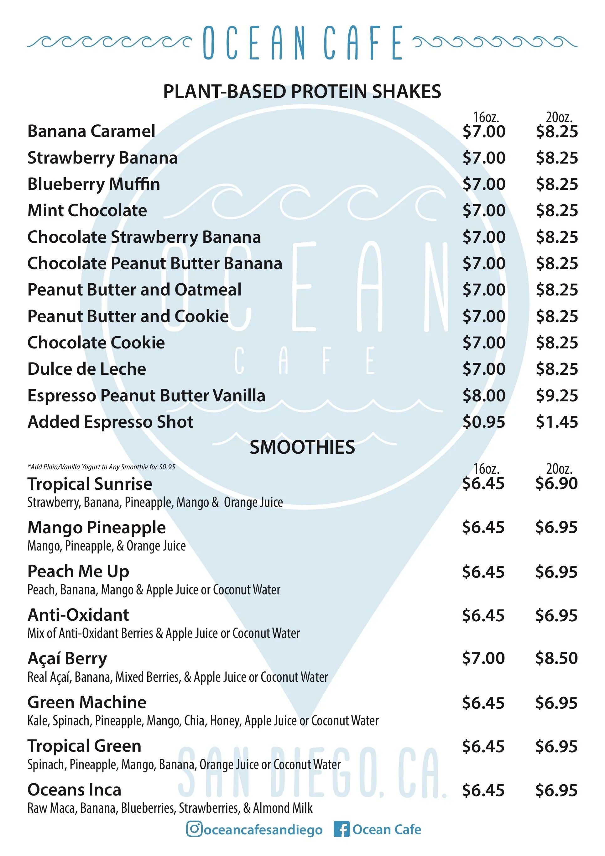
MENU DESIGN
The biggest hurdle when creating the menu for Ocean Cafe was finding a way to include all the options without making it look cluttered or hard to read. Because the logo was so clean and concise I used that as the background image. For the menus items and prices I used s clear legible font and adequate spacing to make sure the reader didn’t get lost while navigating the extensive menu.
